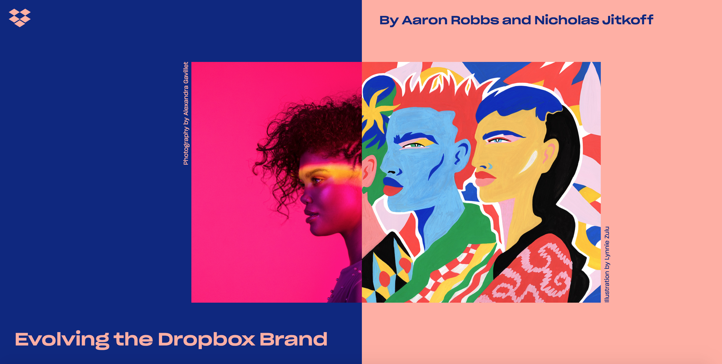
Yesterday, Dropbox unveiled its new brand design on dropbox.design. It’s the biggest change to the Dropbox brand in its 10-year history, and the shift is dramatic. The accompanying .design site gave them a platform to fully present the change and explain the strategic reasons and aesthetic choices behind the relaunch.
Instead of their flagship blue box logo, Dropbox is trying out a whole new range of colors which change depending on which part of the page the user has scrolled to. They explain how this array of color options allows them to keep the normal, recognized blue Dropbox logo for when people are using their product, and employ other colors for other occasions.
The new color combinations for their logo stem from the idea that “extraordinary things happen when diverse minds come together.” And it’s not just their idea, it’s based on their observations of how people actually use Dropbox. They’ve done an incredible job of listening to customers’ pain points and translating them into solutions that help de-clutter their workflows.
It’s interesting to see Dropbox use a .design domain to visually communicate their new brand and their ideas. By using imagery made by fantastic artists, Dropbox is taking the idea of collaboration and the process of creating work together and turning it into artwork.
The content on Dropbox.design is showing us that brands can be both functional and creative. Dropbox, for example, can create a reliable file storage and collaboration tool that we all use it for, and at the same time create artwork to keep inspiring us. Dropbox knows and understands that a good chunk of its users are creative professionals, and making an effort to share their new brand design process with the world is a great way to connect with its community.
It is generally accepted in the design community that sharing how a team accomplished a particular project helps grow the industry overall. Instead of hiding things, sharing knowledge and processes helps push the whole industry to new levels. That’s why we see so many successful influencers, bloggers, or YouTubers who share the majority of their content for free. Watching a free tutorial on YouTube on how to edit an image in Photoshop, for example, helps the community overall as well as building credibility for the person or company who shared the video. In this way, Dropbox.design follows in the innovative and transparent approach set by airbnb.design, facebook.design, uber.design and others.
To complete the shift to being a transparent company that aims to uplift the public design discourse, we can only hope that Dropbox.design becomes a home for content beyond just their brand refresh. It’s a bold start and a good sign that their design team and the company want to engage with not only their customer base but especially with their counterparts in creative design industries.


